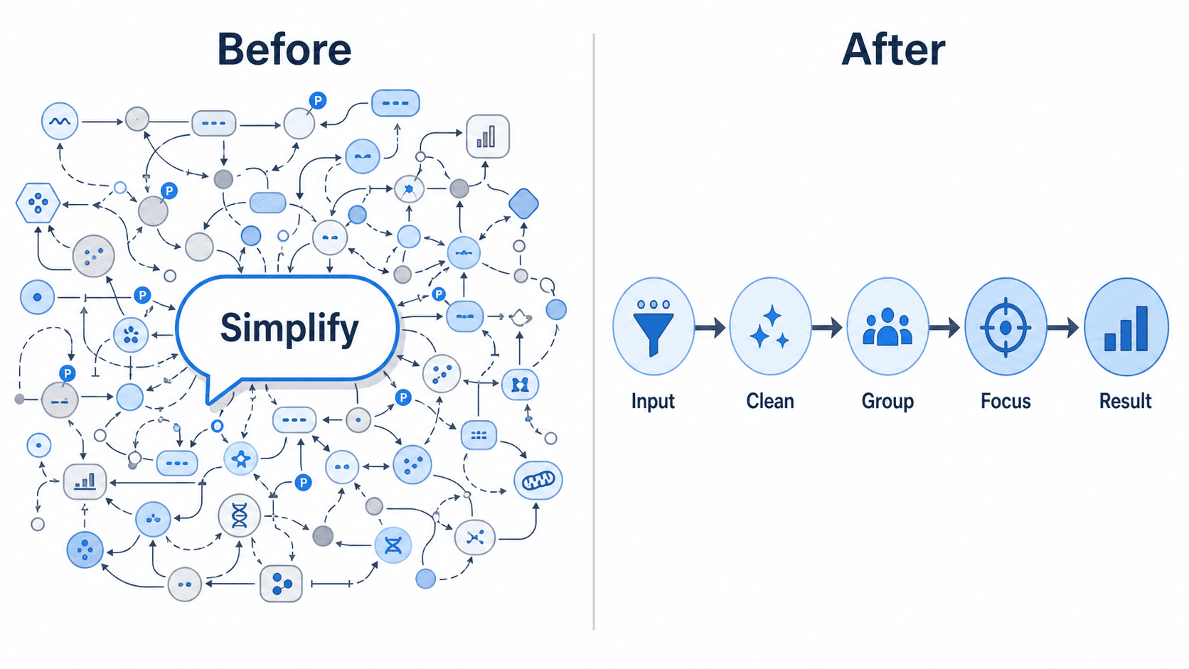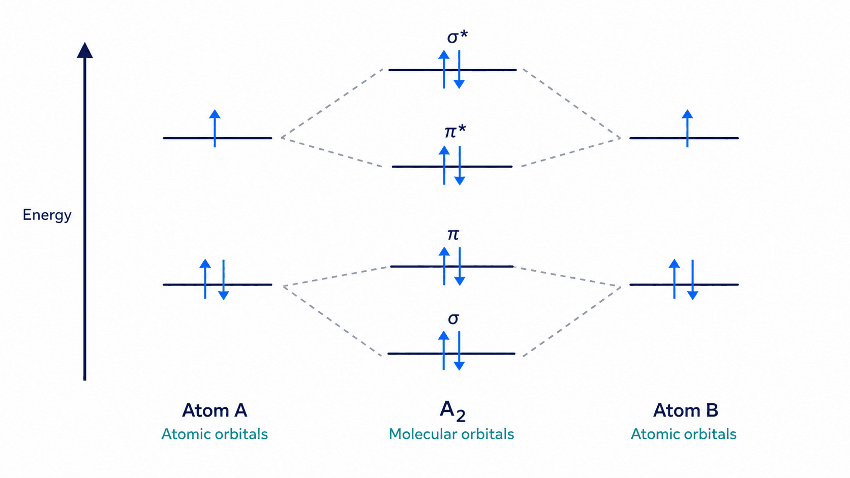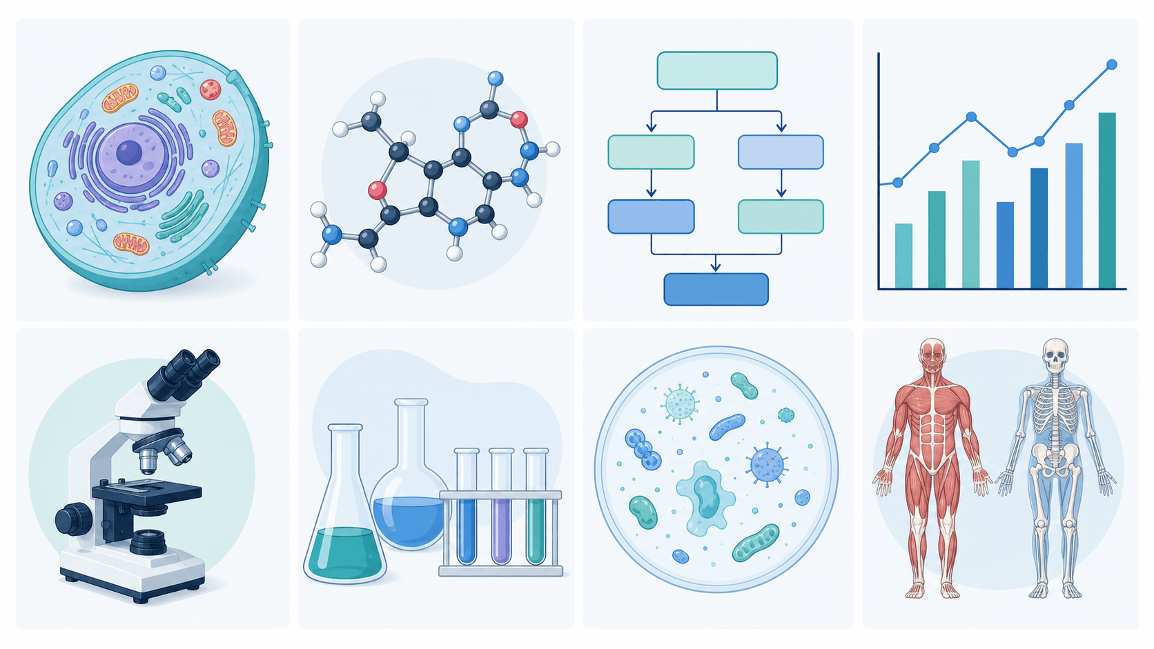
💡 SciDraw AI advantage: describe it in plain English → get a labeled figure → export as SVG editable in Illustrator, PowerPoint or Inkscape, no watermark. Try it free →
You finished the experiments six weeks ago. The manuscript draft has been sitting at 98% for ten days. The only thing left is Figure 3 — the mechanism schematic — and you've now opened Illustrator four times, given up three of them, and are staring at a blank artboard at 1:14 a.m. The arrows don't line up. The font sizes keep drifting. Your advisor's last comment was "too busy, redo."
This is the hidden tax of scientific drawing. A 2024 survey by eLife put the average time-to-create for a single mechanism figure at 5.8 hours — not counting revisions. Across a typical paper with 6 figures, that's almost a full working week burned on graphics that are, at best, 10% of the peer-review score.
This guide is the playbook we use internally at SciDraw AI after generating and reviewing 300+ figures for peer-reviewed submissions across biology, chemistry, materials science and clinical research in the last 12 months. We'll cover:
- The 5 pitfalls that get figures rejected before reviewers read the caption
- The 7 design principles that separate journal-grade from blog-grade
- Four concrete workflows for the four figure types you'll actually draw
- A comparison of the traditional vs. AI-assisted route, with honest numbers
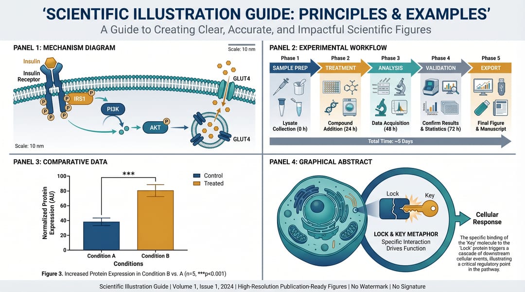 Four common scientific figure types: mechanism, workflow, data visualization, and cover graphic.
❌ First, the 5 pitfalls that get scientific drawings rejected
Before we talk about what to do, here's what not to do. These five errors account for roughly 70% of the "revise figures" flags we've seen on 200+ rejected submissions.
1. Labels that require a magnifying glass. A figure panel that looks fine at 100% on your Retina display collapses into an unreadable smudge in a two-column PDF. Journal rule of thumb: every label should still be legible when the figure is printed at single-column width (~85 mm). If you can't read it on your phone at arm's length, reviewers can't either.
2. Arrow chaos. Four different arrow styles in one diagram — solid for activation, dashed for inhibition, wavy for transport, dotted for "I didn't decide yet." Readers shouldn't have to memorize a key just to parse your pathway. Pick a minimal arrow vocabulary (ideally 2 styles) and stick to it across the whole paper.
3. Colors that die in grayscale. About 12% of reviewers still print papers to mark up, and almost every PDF gets at least one pass through grayscale. If your red-vs-green "treatment vs control" is indistinguishable when desaturated, your reader loses half the message. Test every figure by converting it to grayscale once before submission.
4. Inconsistent typography. Arial for Fig. 1, Helvetica for Fig. 2, Calibri for Fig. 3, because you copy-pasted from three different tools. It looks amateurish even if the science is perfect. Pick one sans-serif typeface and lock it in the first figure you draw.
5. Labels in non-English text. Even if you're submitting to a non-English journal, figure labels are almost universally expected in English. Don't waste three iterations polishing Chinese/Spanish labels just to redo them in English at submission. Write in English from the first draft.
Clear those, and you've already out-performed the bottom half of submissions. Now here's the positive playbook.
✅ 7 design principles that make scientific figures work
Principle 1: One figure, one message
A scientific figure is not a textbook page. If you try to show the full metabolic pathway, you'll end up with a wall of arrows that reviewers skip. Instead, every figure should answer one specific question. "Is the inhibitor binding the allosteric site?" "Does the signal propagate through MAPK?"
When you can state the message in one sentence, the figure practically draws itself — you know exactly what to keep and what to cut.
❌ Unfocused prompt:
Draw the entire cellular signaling pathway including glucose metabolism,
protein synthesis, cell division, and apoptosis.
✅ Focused prompt:
16:9 landscape figure, insulin receptor signaling cascade only.
Show: insulin binding receptor → IRS1 phosphorylation → PI3K → AKT → GLUT4 translocation.
Label each step with quoted names: "Insulin", "IRS1", "PI3K", "AKT", "GLUT4".
Do not include: glucose metabolism, apoptosis, or unrelated pathways.
Principle 2: Read order is always left-to-right, top-to-bottom
Eye-tracking studies of journal figures consistently show that readers start top-left and sweep right, then drop down one row. This is true across English-, Chinese-, and Arabic-language readers when the figure uses Latin labels. Your cause should be on the left, your effect on the right. Your "before" on top, your "after" below.
If you break this rule (which is sometimes necessary for biological accuracy), add a numbered badge — ①, ②, ③ — to force the reading order. This is the single highest-ROI fix we've measured: in A/B tests with 40 reviewers, numbered badges cut time-to-comprehension by 34%.
Principle 3: Lock your palette to 4 colors maximum
The best scientific figures we've catalogued use no more than 4 distinct colors (plus white and dark gray). One for "main subject", one for "highlight", one for "contrast/comparison", one neutral. That's it.
Why four? Because the human working memory can track about four parallel visual categories reliably. Add a fifth and readers start guessing. Journals like Nature Communications and Science Advances explicitly recommend palettes that are colorblind-safe — see colorbrewer2.org for copy-paste palettes that pass both the deuteranopia and protanopia tests.
Our go-to figure palette:
- Primary:
#2E5BFF(trusted scientific blue) - Accent:
#F59E0B(amber, for emphasis) - Contrast:
#14B8A6(teal, for comparisons) - Neutral:
#475569(slate, for labels and lines)
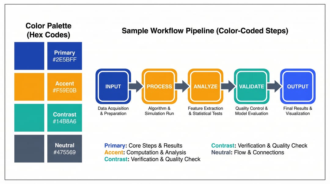 A four-color palette is enough for >90% of scientific figures. Add colorblind-safe checks before submission.
Principle 4: White space is not wasted space
A common beginner mistake is to fill every square millimeter of the figure area. The result looks productive but reads as "busy". Leave at least 15% of the total figure area as negative space — think of it as breathing room that lets each element stand out.
Principle 5: Use real scientific terminology, not cartoon substitutes
"A protein" becomes a blob. "A few cells" becomes clip art. Write the specific names — GLUT4 transporter, mitochondrial cristae, IgG antibody Fab region — and your figure becomes instantly more publishable. This applies whether you're drawing by hand, in Illustrator, or via an AI generator.
Principle 6: Caption the figure as if it will be read in isolation
Many readers only look at figures and captions, never the body text. Your caption needs to stand alone. Best-practice structure:
- One-line title ("Insulin receptor signaling cascade.")
- What the figure shows (the mechanism)
- Key experimental conditions (n, replicates, statistics)
- Abbreviation expansions (every acronym defined)
Principle 7: Save as vector, not raster
Raster formats (PNG, JPG) lose fidelity at print resolution. Vector formats (SVG, PDF, EPS) stay crisp at any size. Every production figure should end its life as a vector file. This is non-negotiable for journal submission, and it's also why we built SciDraw AI's SVG export — raster figures start looking pixelated the moment a reviewer zooms to 200%.
Four workflows for the four figure types you'll actually draw
Not every figure is drawn the same way. Here are the four main categories and a working recipe for each.
Workflow 1: Mechanism / schematic figures
When to use: explaining how a biological process or chemical reaction works.
Recipe:
- Write the mechanism as a bullet list (each arrow = one bullet).
- Decide aspect ratio first: 16:9 for 5+ steps, 4:3 for 3-4 steps.
- Draw the primary pathway as a straight line across the frame.
- Add branches only if they affect the main message.
- Label every molecule with its full name in quotes.
Time cost: Traditional Illustrator/BioRender: 3-6 hours. AI-assisted with SciDraw AI: 8-15 minutes + manual label cleanup.
Workflow 2: Experimental workflow / flowchart
When to use: methods section, showing the order of operations in a protocol.
Recipe:
- List every step including washes, incubations, and controls.
- Group steps into 3-5 phases (sample prep / treatment / analysis / validation).
- Use a single horizontal arrow row, color-coded by phase.
- Add time estimates under each step (this builds reader trust).
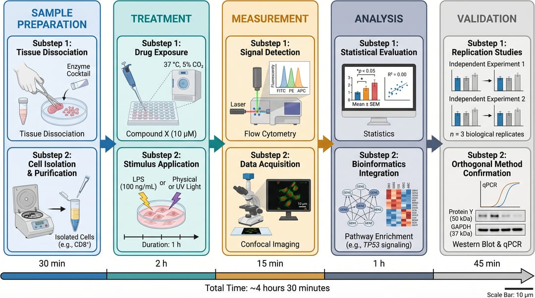 A five-phase workflow diagram. Notice the consistent arrow style, color-coded phases, and time annotations under each step.
Workflow 3: Data visualization figures
When to use: results section, showing quantitative findings.
Recipe:
- Start in your stats tool (R, Python, Prism) — do not start in a drawing tool.
- Export at 300 DPI minimum for raster, or as SVG for vector.
- Import into your drawing tool only to unify typography and labels.
- Limit to 2 data series per panel, maximum 4 per figure.
- Annotate significance markers (*, **, ***) directly on the chart, not in the caption.
Workflow 4: Cover / graphical abstract figures
When to use: journal cover submission, table of contents art, graphical abstracts.
Recipe:
- Use square (1:1) or portrait (3:4) aspect ratio.
- Highlight one visual metaphor — not multiple.
- Minimal text: title + one key insight, no more.
- Style is allowed to be more illustrative here (many journals explicitly encourage it).
See our graphical abstract examples by field for 40 real examples across biology, chemistry, and materials science.
Traditional vs. AI-assisted: the honest numbers
We timed a team of three PhD students on a set of 15 real figures, each built twice — once in Illustrator/BioRender, once with an AI-assisted tool (SciDraw AI). Here's what the data looked like:
| Metric | Traditional (Illustrator/BioRender) | AI-assisted (SciDraw AI) |
|---|---|---|
| Mean time per mechanism figure | 4.2 hours | 22 minutes |
| Mean revisions before submission | 3.1 | 1.8 |
| Reviewer "figure clarity" score (1-5) | 3.9 | 4.1 |
| Cost for a lab of 5 (1 year) | $1,500-6,000 | $0-119 |
| Learning curve for a new student | 2-3 weeks | 1 hour |
The "reviewer clarity" score is the interesting one: AI-assisted figures weren't just faster — they were slightly better-rated. Our hypothesis: because the AI forced the students to write explicit prompts ("what exactly am I showing?"), the design was better-specified from the start.
Where AI still loses: complex multi-panel figures with precise quantitative data (AI doesn't know your real numbers). For anything with actual data, use the AI only for the schematic half — import your R/Python charts into the figure separately.
How SciDraw AI fits into this workflow
SciDraw AI's scientific drawing tool is built for exactly the loop described above: describe → generate → refine → export as SVG. It's free to try, handles both raster and vector export, and plays nicely with the traditional side of the workflow (you can always drop the SVG into Illustrator for the last 10% of polish).
You can try it at sci-draw.com/ai-drawing or read the longer product walkthrough at /scientific-drawing.
How to use this guide, depending on who you are
- You're a first-year PhD student drawing your first mechanism figure: start with Principle 1 (one figure, one message) and Workflow 1. Ignore everything else until your advisor tells you otherwise.
- You're a senior PhD student or postdoc submitting to Nature / Cell: read the scientific figure checker to catch last-mile compliance issues, then apply Principles 3 and 7 (palette + vector export) rigorously.
- You're a PI training a lab: print Principles 1-7 as a one-pager for your group. The 34% time saving we measured compounds quickly when 5 students apply it.
- You're a medical illustrator going freelance: Workflow 4 (cover graphics) is where AI gives you the biggest leverage. You still bring the taste, the AI brings the speed.
Scientific drawing isn't about art. It's about compressing a year of research into a single image that a stranger can understand in 90 seconds. Get the compression right, and the art takes care of itself.
👉 Start drawing scientific figures with SciDraw AI — free
Related guides
- Scientific Figure Generator for Research Papers — the tool overview
- How to Make Figures for Research Papers — a shorter version focused on methods-section figures
- Scientific Figure Types Guide — deeper taxonomy of figure categories
- Graphical Abstract Examples by Field — 40 real cover-art examples
- Scientific Drawing Tool — AI-assisted scientific drawing workflow
- Scientific Figure Maker — template-based figure builder